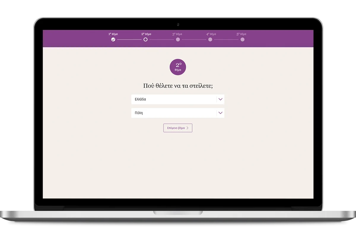
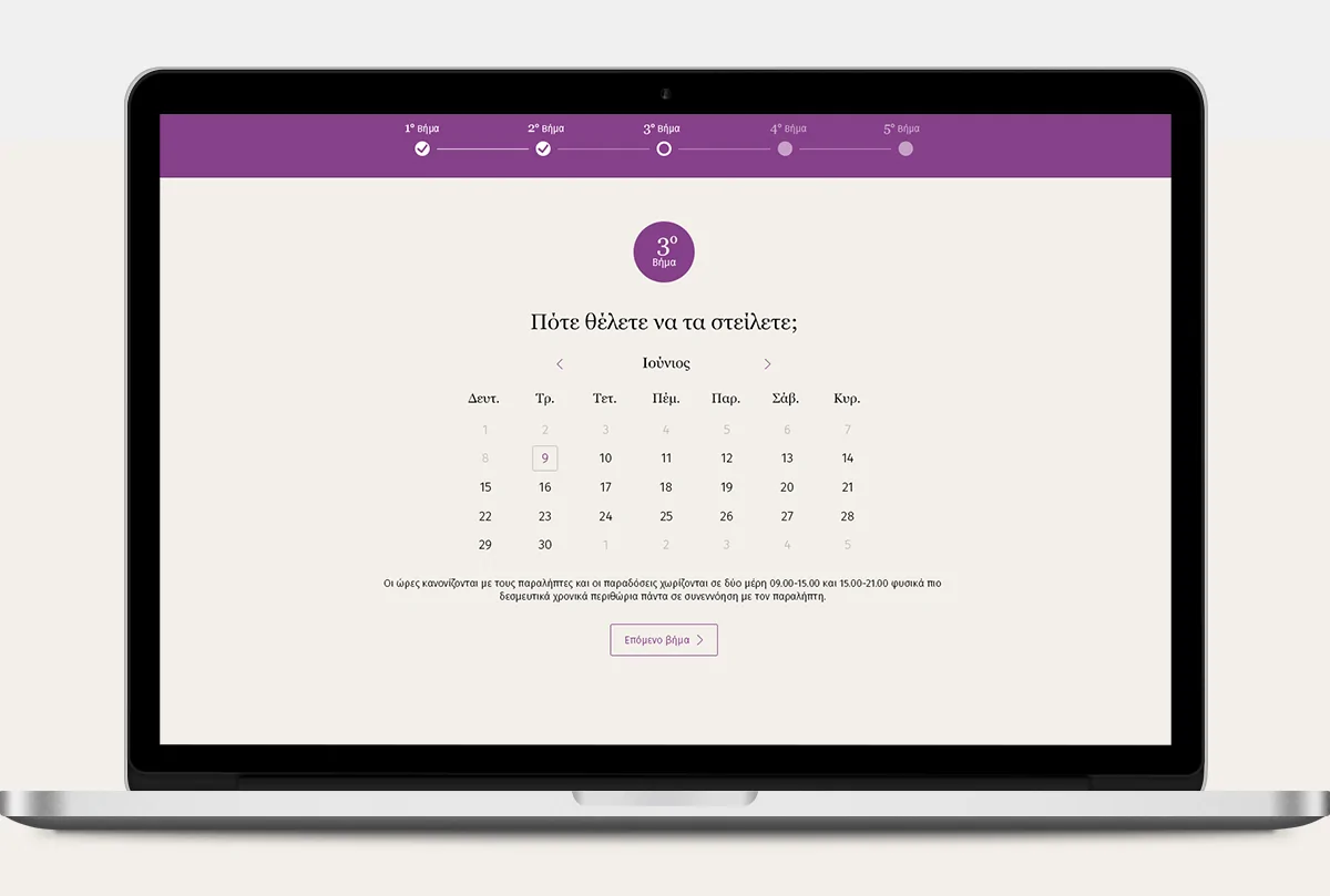
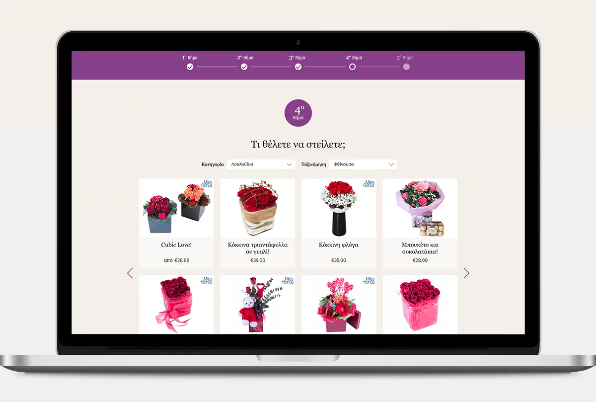
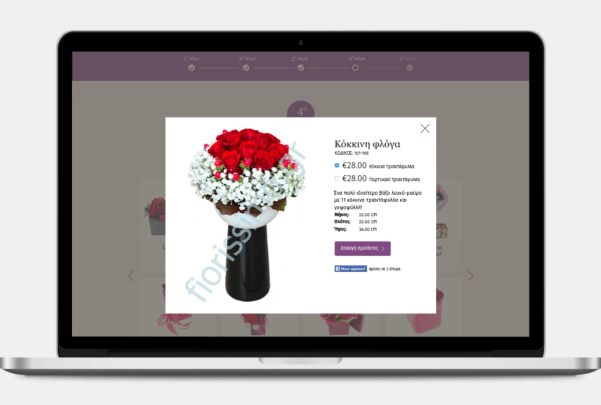
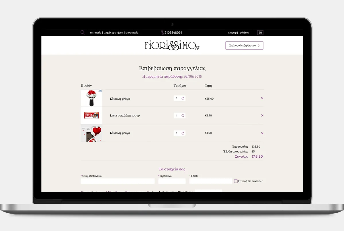
With their new site, Fiorissimo offers the ability to its clients to find what they are looking for in a few steps!
There was a big problem to overcome with this redesign. The mechanism they had on the previous site was problematic and it lead to cart abandonment. That was because Fiorissimo has several partners inside and outside Greece and, accordingly, the shipping area, the flowers are sent by another partner. Most of the time users placed items in their cart that, at the end, couldn't buy.
That is why, we thought of these easy steps where at the first step the users must choose where and when they want to send their flowers. Only items that are available for their selections are shown. In this way we managed to reduce the cart abandonment and increase the website' s traffic.
Things are going so well that they decided to "close" the website on Valentines day 2017 because of the huge number of orders :)
- ROLE
- Art direction, Web design
- AGENCY
- Netstudio
- DATE
- 2015

